It's happened three times in the last several months: I am invited into, or stumble into, a discussion on "Frontloading." It's been the case that the people who are talking about it are generally convinced it exists, and generally believe it's a widely practiced approach.
In case you don't know, frontloading is the presumed practice of enrollment managers (of course) who make big institutional aid awards to entice freshmen to enroll, and then remove them after the freshman year. Journalists, especially, point to aggregated data suggesting that the average amount of institutional aid for non-freshmen is lower than for freshmen. "Aha!" they scream, "The smoking gun!"
Well, not so fast. I'm willing to admit that there may be a few colleges in the US where frontloading happens, probably in a clandestine manner, but perhaps, in at least one instance I was made aware of, for a very logical and justifiable reason. But most enrollment managers I've asked have the same reaction to the concept: To do so would be career suicide. This does not deter those who love to skewer enrollment management and hoist the problems of higher education squarely on our backs.
To be sure, I asked a Facebook group of 9,000 college admissions officers, high school counselors, and independent college consultants about the practice. This is not a group of wallflowers, and the group members call it like they see it; even so, I asked them to message me privately if there were colleges where this routinely happened. I got a couple of "I think maybe it happens," responses, and exactly one comment from a counselor who said she was sure it happened.
I have told people repeatedly that there are many possible reasons why the data look the way they do:
- The freshman data is first-time, full-time, degree seeking students. All of them are technically eligible for institutional aid.
- The "All students" data includes all undergraduates. That includes full-time, part-time, non-degree seeking students, many of whom are less likely to qualify for aid.
- The "All students" group also contains transfers, who may qualify for less aid
- It's possible that students who earned aid as a freshman lose it due to lack of academic progress or performance in subsequent years
- It's also possible students with the most institutional aid are the neediest, and thus not likely to be around past the freshman year
These reasons seem to fall on deaf ears of people who are eager to prove something they believe to be true.
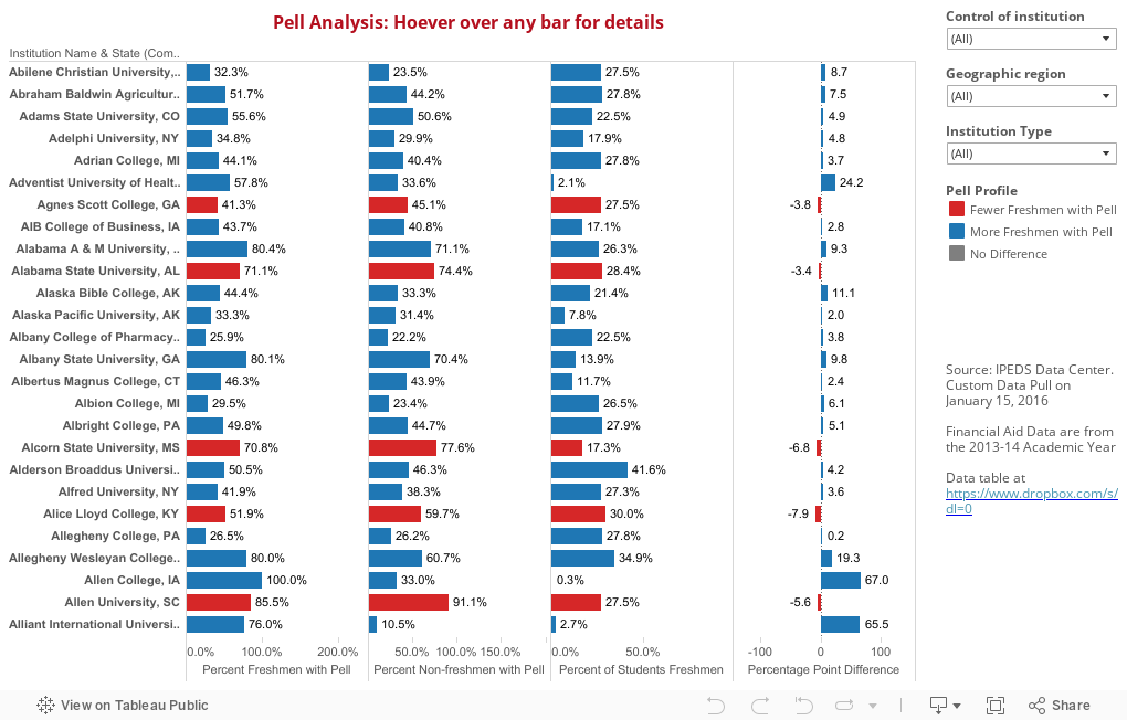
So I tried another angle: Doing the same comparison of Pell Grant participation. The Pell Grant, of course, is a federal program, not awarded by or controlled by the colleges. What would happen if we looked at Pell Grant participation rates among freshmen and the rest of the student body? I think this visualization, below, demonstrates it quite well.
There are four columns:
- Percent of freshmen with Pell
- Percent of all other undergraduates (non-freshmen) with Pell
- The percentage of undergraduates who are freshmen (in a traditional college, this should be about 25%-30%. Bigger or smaller numbers can tip off a different mix)
- And finally, the right hand column, showing the difference between the first two.
The bars are color-coded: Blue bars show more freshmen with Pell; red bars show fewer freshmen with Pell, and gray bars show no difference. You'll note that most bars are blue; if this were institutional aid, you might leap to the conclusion of frontloading. That's exactly what journalists do.
But it's not institutional aid. It's federal aid. And yet, the differences are very large at some places.
You can hover over the top of any column to sort by that column. And you can use the filters at the right to limit the colleges included on the view to certain regions, control, or Carnegie type.
Is this evidence strong enough to convince you? If not, let me know why in the comments below.
- Hallo sahabat
The secret, Pada Artikel yang anda baca kali ini dengan judul Januari 2016, kami telah mempersiapkan artikel ini dengan baik untuk anda baca dan ambil informasi didalamnya. mudah-mudahan isi postingan yang kami tulis ini dapat anda pahami. baiklah, selamat membaca.
Judul :
The latest Boogey Man: Frontloadinglink :
The latest Boogey Man: Frontloading
Baca juga
Januari 2016
It's happened three times in the last several months: I am invited into, or stumble into, a discussion on "Frontloading." It's been the case that the people who are talking about it are generally convinced it exists, and generally believe it's a widely practiced approach.
In case you don't know, frontloading is the presumed practice of enrollment managers (of course) who make big institutional aid awards to entice freshmen to enroll, and then remove them after the freshman year. Journalists, especially, point to aggregated data suggesting that the average amount of institutional aid for non-freshmen is lower than for freshmen. "Aha!" they scream, "The smoking gun!"
Well, not so fast. I'm willing to admit that there may be a few colleges in the US where frontloading happens, probably in a clandestine manner, but perhaps, in at least one instance I was made aware of, for a very logical and justifiable reason. But most enrollment managers I've asked have the same reaction to the concept: To do so would be career suicide. This does not deter those who love to skewer enrollment management and hoist the problems of higher education squarely on our backs.
To be sure, I asked a Facebook group of 9,000 college admissions officers, high school counselors, and independent college consultants about the practice. This is not a group of wallflowers, and the group members call it like they see it; even so, I asked them to message me privately if there were colleges where this routinely happened. I got a couple of "I think maybe it happens," responses, and exactly one comment from a counselor who said she was sure it happened.
I have told people repeatedly that there are many possible reasons why the data look the way they do:
- The freshman data is first-time, full-time, degree seeking students. All of them are technically eligible for institutional aid.
- The "All students" data includes all undergraduates. That includes full-time, part-time, non-degree seeking students, many of whom are less likely to qualify for aid.
- The "All students" group also contains transfers, who may qualify for less aid
- It's possible that students who earned aid as a freshman lose it due to lack of academic progress or performance in subsequent years
- It's also possible students with the most institutional aid are the neediest, and thus not likely to be around past the freshman year
These reasons seem to fall on deaf ears of people who are eager to prove something they believe to be true.
So I tried another angle: Doing the same comparison of Pell Grant participation. The Pell Grant, of course, is a federal program, not awarded by or controlled by the colleges. What would happen if we looked at Pell Grant participation rates among freshmen and the rest of the student body? I think this visualization, below, demonstrates it quite well.
There are four columns:
- Percent of freshmen with Pell
- Percent of all other undergraduates (non-freshmen) with Pell
- The percentage of undergraduates who are freshmen (in a traditional college, this should be about 25%-30%. Bigger or smaller numbers can tip off a different mix)
- And finally, the right hand column, showing the difference between the first two.
The bars are color-coded: Blue bars show more freshmen with Pell; red bars show fewer freshmen with Pell, and gray bars show no difference. You'll note that most bars are blue; if this were institutional aid, you might leap to the conclusion of frontloading. That's exactly what journalists do.
But it's not institutional aid. It's federal aid. And yet, the differences are very large at some places.
You can hover over the top of any column to sort by that column. And you can use the filters at the right to limit the colleges included on the view to certain regions, control, or Carnegie type.
Is this evidence strong enough to convince you? If not, let me know why in the comments below.