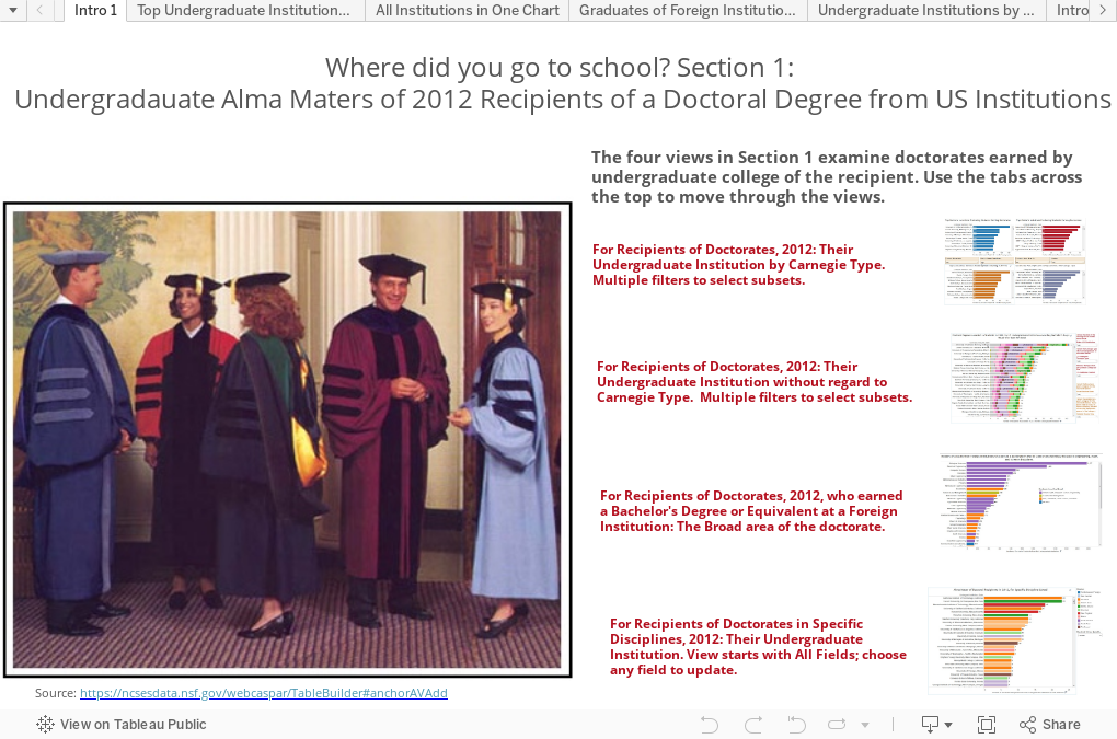
Advertisement

Jangan lupa olahraga biar nggak baper (ˇ▼ˇ)

Kamis, 31 Desember 2015

Review Snail Camera

REVIEW SNAIL CAMERA


Snail Camera merupakan sebuah aplikasi kamera yang dibuat untuk android. Snail Camera terdiri dari dua macam yaitu Snail Camera versi gratis, dan Snail Camera Pro yang berbayar. Kali ini kita akan membahas tentang aplikasi ini.
Snail Camera mempunyai sebuah tampilan yang dibilang cukup simple, dengan semua bentuk pilihan entah itu menu dan tombol mengambil gambar ada disebelah kanan.


Dan yang ada di atas merupakan tampilan dari Snail Camera. Yang ditampilkan diatas merupakan tampilan dari Snail Camera Pro, dengan kamera yang sengaja ditutup.
Dalam Snail Camera terdapat beberapa pilihan mode pengambilan gambar antara lain sebagai berikut:
1.       Normal Mode
2.       Enhanced Mode
3.       Multi Mode
4.       Bulb Mode


      Normal Mode

Normal Mode merupakan mode pengambilan gambar seperti biasa saja, bisa ditambahkan dengan beberapa efek ataupun pengaturan yang lain (Untuk bagian efek ataupun pengaturan lain berada dibawah). Dan Normal Mode merupakan mode awal dimana ketika kita membuka aplikasi Snail Camera.

   Enhanced Mode

Enhanced Mode, tentunya anda bertanya apa fungsi dari Enhanced Mode? Jika dilihat dengan sekilas Enhanced Mode terlihat sama seperti Normal Mode. Namun, jika diperhatikan dengan seksama dibawah pilihan shutter ada pengaturan warna, nah hal ini yang merupakan kegunaan dari Enhanced Mode.
Catatan: Pengaturan warna yang dimaksud adalah lingkaran yang ada di sebelah kiri kotak yang berwarna hijau. Dan kotak hijau tersebut adalah kotak perintah jika diaktifkan maka kotak itu berwarna hijau. Perintah tersebut meliputi pengaturan warna yang kita atur dari dari lingkaran yang ada di sebelah kotak tersebut.


Pada gambar diatas terdapat tiga pilihan yang bisa dinaikkan atau diturunkan (Ke kanan dan ke kiri). Pilihan pertama yaitu sebagai pengatur kecerahan warna, pilihan kedua yaitu pewarnaan hitam dan putih atau disebut BW, pilihan ketiga adalah satruasi warna.
Multi Mode


Multi Mode merupakan suatu pilihan dimana kita dapat mengambil sebuah foto dengan beberapa kali dengan background yang sama ataupun berbeda dan diolah menjadi satu foto.
Dari gambar diatas dapat kita lihat dibawah tombol shutter terdapat gambar dan gambar itu merupakan suatu pilihan “selesai, silahkan olah” yang akan kita tekan ketika sudah selesai mengambil foto. Dibawahnya gambar tersebut terdapat tulisan “0exp” itu berarti menunjukkan jumlah frame yang telah anda ambil untuk dijadikan satu foto. Jika anda telah mengambil foto sebanyak 2 kali maka tulisan tersebut akan berubah menjadi “2exp”.
Selanjutnya terdapat kotak hijau yang berarti “Ya” atau “tidak”. Sebelum membahas kotak hijau tersebut, saya akan menjelaskan tentang gambar mata yang anda lihat disebelah kotak tersebut. Gambar mata tersebut mengartikan “tampilkan frame jika anda telah memotret satu kali dan ingin melihat hasil sementara jika anda ingin meemotret sekali lagi sampai anda akhirnya selesai”. Dari penjelasan gambar mata tersebut tentunya anda mengerti apa maksud dari kotak hijau tersebut. Silahkan anda coba pada aplikasi Snail Camera anda.

 Bulb Mode


Bulb Mode, merupakan suatu mode pembukaan lensa kamera sehingga membuat kamera dapat menangkap cahaya ataupun apapun yang bergegak sehingga meninggalkan jejak. Mode ini sama seperti mode Slow pada kamera DSLR ataupun pada aplikasi Camera FV-5.
Untuk lebih mengetahui, Bulb Mode terdapat berbagai macam pilihan yang dapat kita lihat pada gambar yang ada dibawah tombol shutter. Pilihan itu terdiri dari normalize, HDR, selective, dan average. Bagi anda yang penasaran dengan mode-mode pada Bulb Mode silahkan anda mencobanya pada Snail Camera anda, dengan terus mencoba maka anda akan mendapat sebuah hasil yang sangat spektakuler dan tentunya ilmu dan wawasan yang baru, sehingga tidak terikat pada sebuah artikel saja. Bagaimana menggati dari normalize ke pilihan Bulb Mode lainnya? Anda hanya perlu menekan gambar statistik yang ada diatas tulisan normalize, maka anda akan berpindah ke pilihan selanjutnya yaitu HDR, jika anda menekan lagi maka akan menuju ke pengambilan gambar secara selective, dan jika anda menekan lagi maka akan menuju ke average, dan kembali lagi ke normalize jika anda menekannya lagi.
Jadi susunannya adalah
Normalize > HDR > Selevtive > Average > (kembali lagi ke awal)
Selanjutnya kembali ke Bulb Mode, terdapat pilihan pengaturan warna pada gambar seperti pada Enhanced Mode, dan tentunya saya pikir sudah tidak perlu dijelaskan lagi kepada anda.

Kamera setting Snail Camera – Untuk membuka kamera setting anda hanya perlu menekan pilihan yang ada di kanan atas kamera, lebih tepatnya di sebelah kiri dalam memilih mode kamera ( < ).


Apa yang ada dalam pilihan pengaturan kamera? Berikut ulasannya.
Pada pilihan pengaturan terdapat menu Parameters, Tools, Display, Swap, dan More.
1.      
      Parameters


Pada pilihan parameters, terdapat pilihan Flash, White Balance, Exposition, Focus, Scenes, dan Effects.
Pada pilihan Flash terdapat pilihan pengaturan lampu Flash anda, dalam mode Off, Auto, On, Red Eye, Torch. Yang mempunyai fungsi yang berbeda-beda.

White Balance


Lalu pada White Balance, anda dapat mengatur mode kamera, dalamnya terdapat pilihan Auto, Daylight, Cloudy, Twilight, Incadescen, Fluorscent. Maksudnya mode ini adalah tipe cahaya yang akan berpengaruh pada gambar.


Selanjutnya Exposition, berguna untuk kecerahan gambar anda dapat menaikkan sampai +3.0ev dan menurunkannya sampai -3.0ev.

Focus


Focus, ini merupakan pemfocusan camera. Terdapat tiga pilihan Focus yaitu Auto, Macro, dan Infinity.
Focus auto atau bisa disebut auto focus merupakan mode dimana kamera dapat memfocuskan pandangan kepada objek terdekat sesuai dengan kemampuan kameranya.
Macro focus adalah tipe focus yang digunakan untuk memotret foto macro, dengan cara anda menentukan titik focus objek yang hendak anda ambil.
Infinity focus adalah focus tak terbatas, biasanya focus ini digunakan untuk mengambil sebuah foto pemandangan.

Scenes


Kita masuk dalam Scenes, scenes ini adalah sebuah pengaturan bagi anda untuk memotret sebuah gambar sesuai dengan situasinya, dan tentunya scenes ini sudah diatur secara tepat bagaimana ISO dan beberapa pengaturan lainnya yang cocok pada smartphone anda dalam keadaan yang tercantum.
Dalam Scenes terdapat, auto, portrait, landscape, night, night portrait, steady, beach, snow, sunset, fireworks, sport, party, candle, dan theatre. Tentunya itu mempunyai setinggan yang berbeda-beda, contohnya fireworks mempunyai pengaturan ISO yang berbeda dengan landscape.

Effects


Dalam effects terdapat pilihan warna gambar yaitu normal, mono, sepia, aqua, negative, blackboard, whiteboard. Dan tentunya warna gambar yang dihasilkan foto tersebut sangatlah unik.

Tools


Pada pilihan tools terdapat 3 pilihan yaitu Timer, Noise Reduction Off (bisa menjadi On bila kita memilih pilihan selanjutnya yaitu Noise Acquistion), serta yang telah dikatakan sebelumnya yaitu Noise Acquistion.
Timer merupakan hitungan mundur setelah kita menekan tombol shutter dan ketika hitungan mundur itu habis maka kamera langsung mengambil gambar.
Noise Reduction Off/On fungsi ini akan bekerja ketika kita memilih pilihan selanjutnya yaitu Noise Acquistion. Fungsi dari kedua pilihan ini berbicara tentang noise yang dihasilkan kamera ketika mengambil foto, maka oleh sebab itu pilihan ini digunakan untuk menurunkan noise sebuah pada kamera ketika mengambil gambar dengan menggunakan sensor dari kamera sehingga kamera secara otomatis menurunkan noisenya. Kembali lagi ke Noise Reduction Off/On, maksudnya adalah pilihan “Ya” atau “Tidak” jika ingin menurunkan noise. Pada gambar diatas merupakan setingan bahwa noise tidak diturunkan.

Display Setting

Display Setting adalah pengaturan dalam mengambil gambar. Terdapat pilihan Histogram On/Off, Grid Golden, dan Level Off.
Histogram jika dinyalakan (on) maka anda akan melihatnya di sebelah kiri dengan sebuah kotak yang akan menujukkan statistic warna.
Grid Golden, adalah tampilan garis-garis yang menunjukkan sebuah bidang kotak, bisa digunakan untuk mengambil gambar agar terlihat rata.
Level jika dinyalakan (on) maka akan menampilkan kerataan kamera dengan tampilan seperti saat zoom menggunakan sniper di game counter strike.

Swap
Pilihan ini merupakan pilihan untuk menggunakan kamera depan atau belakang (mengganti kamera). 

More


Dalam pilihan ini semua menu yang ditampilkan seperti diatas akan diubah menjadi seperti dibawah ini dengan tujuan agar pengguna mengerti.

Bagaimana cara melihat gambar yang telah diambil dengan aplikasi ini?
Cukup dengan memilih gambar yang berarti galeri yang ada di bagian kanan bawah kamera.


Anda telah membaca artikel tentang SNAIL KAMERA, jika anda ingin copy artikel ini mohon menuliskan link ini atau blog ini sebagai sumber artikel.
2015 - Hallo sahabat The secret, Pada Artikel yang anda baca kali ini dengan judul 2015, kami telah mempersiapkan artikel ini dengan baik untuk anda baca dan ambil informasi didalamnya. mudah-mudahan isi postingan Artikel photoblog, Artikel smartphone, Artikel snail camera, yang kami tulis ini dapat anda pahami. baiklah, selamat membaca.

Judul : Review Snail Camera
link : Review Snail Camera

Baca juga


2015

REVIEW SNAIL CAMERA


Snail Camera merupakan sebuah aplikasi kamera yang dibuat untuk android. Snail Camera terdiri dari dua macam yaitu Snail Camera versi gratis, dan Snail Camera Pro yang berbayar. Kali ini kita akan membahas tentang aplikasi ini.
Snail Camera mempunyai sebuah tampilan yang dibilang cukup simple, dengan semua bentuk pilihan entah itu menu dan tombol mengambil gambar ada disebelah kanan.


Dan yang ada di atas merupakan tampilan dari Snail Camera. Yang ditampilkan diatas merupakan tampilan dari Snail Camera Pro, dengan kamera yang sengaja ditutup.
Dalam Snail Camera terdapat beberapa pilihan mode pengambilan gambar antara lain sebagai berikut:
1.       Normal Mode
2.       Enhanced Mode
3.       Multi Mode
4.       Bulb Mode


      Normal Mode

Normal Mode merupakan mode pengambilan gambar seperti biasa saja, bisa ditambahkan dengan beberapa efek ataupun pengaturan yang lain (Untuk bagian efek ataupun pengaturan lain berada dibawah). Dan Normal Mode merupakan mode awal dimana ketika kita membuka aplikasi Snail Camera.

   Enhanced Mode

Enhanced Mode, tentunya anda bertanya apa fungsi dari Enhanced Mode? Jika dilihat dengan sekilas Enhanced Mode terlihat sama seperti Normal Mode. Namun, jika diperhatikan dengan seksama dibawah pilihan shutter ada pengaturan warna, nah hal ini yang merupakan kegunaan dari Enhanced Mode.
Catatan: Pengaturan warna yang dimaksud adalah lingkaran yang ada di sebelah kiri kotak yang berwarna hijau. Dan kotak hijau tersebut adalah kotak perintah jika diaktifkan maka kotak itu berwarna hijau. Perintah tersebut meliputi pengaturan warna yang kita atur dari dari lingkaran yang ada di sebelah kotak tersebut.


Pada gambar diatas terdapat tiga pilihan yang bisa dinaikkan atau diturunkan (Ke kanan dan ke kiri). Pilihan pertama yaitu sebagai pengatur kecerahan warna, pilihan kedua yaitu pewarnaan hitam dan putih atau disebut BW, pilihan ketiga adalah satruasi warna.
Multi Mode


Multi Mode merupakan suatu pilihan dimana kita dapat mengambil sebuah foto dengan beberapa kali dengan background yang sama ataupun berbeda dan diolah menjadi satu foto.
Dari gambar diatas dapat kita lihat dibawah tombol shutter terdapat gambar dan gambar itu merupakan suatu pilihan “selesai, silahkan olah” yang akan kita tekan ketika sudah selesai mengambil foto. Dibawahnya gambar tersebut terdapat tulisan “0exp” itu berarti menunjukkan jumlah frame yang telah anda ambil untuk dijadikan satu foto. Jika anda telah mengambil foto sebanyak 2 kali maka tulisan tersebut akan berubah menjadi “2exp”.
Selanjutnya terdapat kotak hijau yang berarti “Ya” atau “tidak”. Sebelum membahas kotak hijau tersebut, saya akan menjelaskan tentang gambar mata yang anda lihat disebelah kotak tersebut. Gambar mata tersebut mengartikan “tampilkan frame jika anda telah memotret satu kali dan ingin melihat hasil sementara jika anda ingin meemotret sekali lagi sampai anda akhirnya selesai”. Dari penjelasan gambar mata tersebut tentunya anda mengerti apa maksud dari kotak hijau tersebut. Silahkan anda coba pada aplikasi Snail Camera anda.

 Bulb Mode


Bulb Mode, merupakan suatu mode pembukaan lensa kamera sehingga membuat kamera dapat menangkap cahaya ataupun apapun yang bergegak sehingga meninggalkan jejak. Mode ini sama seperti mode Slow pada kamera DSLR ataupun pada aplikasi Camera FV-5.
Untuk lebih mengetahui, Bulb Mode terdapat berbagai macam pilihan yang dapat kita lihat pada gambar yang ada dibawah tombol shutter. Pilihan itu terdiri dari normalize, HDR, selective, dan average. Bagi anda yang penasaran dengan mode-mode pada Bulb Mode silahkan anda mencobanya pada Snail Camera anda, dengan terus mencoba maka anda akan mendapat sebuah hasil yang sangat spektakuler dan tentunya ilmu dan wawasan yang baru, sehingga tidak terikat pada sebuah artikel saja. Bagaimana menggati dari normalize ke pilihan Bulb Mode lainnya? Anda hanya perlu menekan gambar statistik yang ada diatas tulisan normalize, maka anda akan berpindah ke pilihan selanjutnya yaitu HDR, jika anda menekan lagi maka akan menuju ke pengambilan gambar secara selective, dan jika anda menekan lagi maka akan menuju ke average, dan kembali lagi ke normalize jika anda menekannya lagi.
Jadi susunannya adalah
Normalize > HDR > Selevtive > Average > (kembali lagi ke awal)
Selanjutnya kembali ke Bulb Mode, terdapat pilihan pengaturan warna pada gambar seperti pada Enhanced Mode, dan tentunya saya pikir sudah tidak perlu dijelaskan lagi kepada anda.

Kamera setting Snail Camera – Untuk membuka kamera setting anda hanya perlu menekan pilihan yang ada di kanan atas kamera, lebih tepatnya di sebelah kiri dalam memilih mode kamera ( < ).


Apa yang ada dalam pilihan pengaturan kamera? Berikut ulasannya.
Pada pilihan pengaturan terdapat menu Parameters, Tools, Display, Swap, dan More.
1.      
      Parameters


Pada pilihan parameters, terdapat pilihan Flash, White Balance, Exposition, Focus, Scenes, dan Effects.
Pada pilihan Flash terdapat pilihan pengaturan lampu Flash anda, dalam mode Off, Auto, On, Red Eye, Torch. Yang mempunyai fungsi yang berbeda-beda.

White Balance


Lalu pada White Balance, anda dapat mengatur mode kamera, dalamnya terdapat pilihan Auto, Daylight, Cloudy, Twilight, Incadescen, Fluorscent. Maksudnya mode ini adalah tipe cahaya yang akan berpengaruh pada gambar.


Selanjutnya Exposition, berguna untuk kecerahan gambar anda dapat menaikkan sampai +3.0ev dan menurunkannya sampai -3.0ev.

Focus


Focus, ini merupakan pemfocusan camera. Terdapat tiga pilihan Focus yaitu Auto, Macro, dan Infinity.
Focus auto atau bisa disebut auto focus merupakan mode dimana kamera dapat memfocuskan pandangan kepada objek terdekat sesuai dengan kemampuan kameranya.
Macro focus adalah tipe focus yang digunakan untuk memotret foto macro, dengan cara anda menentukan titik focus objek yang hendak anda ambil.
Infinity focus adalah focus tak terbatas, biasanya focus ini digunakan untuk mengambil sebuah foto pemandangan.

Scenes


Kita masuk dalam Scenes, scenes ini adalah sebuah pengaturan bagi anda untuk memotret sebuah gambar sesuai dengan situasinya, dan tentunya scenes ini sudah diatur secara tepat bagaimana ISO dan beberapa pengaturan lainnya yang cocok pada smartphone anda dalam keadaan yang tercantum.
Dalam Scenes terdapat, auto, portrait, landscape, night, night portrait, steady, beach, snow, sunset, fireworks, sport, party, candle, dan theatre. Tentunya itu mempunyai setinggan yang berbeda-beda, contohnya fireworks mempunyai pengaturan ISO yang berbeda dengan landscape.

Effects


Dalam effects terdapat pilihan warna gambar yaitu normal, mono, sepia, aqua, negative, blackboard, whiteboard. Dan tentunya warna gambar yang dihasilkan foto tersebut sangatlah unik.

Tools


Pada pilihan tools terdapat 3 pilihan yaitu Timer, Noise Reduction Off (bisa menjadi On bila kita memilih pilihan selanjutnya yaitu Noise Acquistion), serta yang telah dikatakan sebelumnya yaitu Noise Acquistion.
Timer merupakan hitungan mundur setelah kita menekan tombol shutter dan ketika hitungan mundur itu habis maka kamera langsung mengambil gambar.
Noise Reduction Off/On fungsi ini akan bekerja ketika kita memilih pilihan selanjutnya yaitu Noise Acquistion. Fungsi dari kedua pilihan ini berbicara tentang noise yang dihasilkan kamera ketika mengambil foto, maka oleh sebab itu pilihan ini digunakan untuk menurunkan noise sebuah pada kamera ketika mengambil gambar dengan menggunakan sensor dari kamera sehingga kamera secara otomatis menurunkan noisenya. Kembali lagi ke Noise Reduction Off/On, maksudnya adalah pilihan “Ya” atau “Tidak” jika ingin menurunkan noise. Pada gambar diatas merupakan setingan bahwa noise tidak diturunkan.

Display Setting

Display Setting adalah pengaturan dalam mengambil gambar. Terdapat pilihan Histogram On/Off, Grid Golden, dan Level Off.
Histogram jika dinyalakan (on) maka anda akan melihatnya di sebelah kiri dengan sebuah kotak yang akan menujukkan statistic warna.
Grid Golden, adalah tampilan garis-garis yang menunjukkan sebuah bidang kotak, bisa digunakan untuk mengambil gambar agar terlihat rata.
Level jika dinyalakan (on) maka akan menampilkan kerataan kamera dengan tampilan seperti saat zoom menggunakan sniper di game counter strike.

Swap
Pilihan ini merupakan pilihan untuk menggunakan kamera depan atau belakang (mengganti kamera). 

More


Dalam pilihan ini semua menu yang ditampilkan seperti diatas akan diubah menjadi seperti dibawah ini dengan tujuan agar pengguna mengerti.

Bagaimana cara melihat gambar yang telah diambil dengan aplikasi ini?
Cukup dengan memilih gambar yang berarti galeri yang ada di bagian kanan bawah kamera.


Anda telah membaca artikel tentang SNAIL KAMERA, jika anda ingin copy artikel ini mohon menuliskan link ini atau blog ini sebagai sumber artikel.

Selasa, 17 November 2015

How will demographics change enrollment?

Ever since I started in admissions, people have been talking about demographics changes and challenges, and the chant continues.  The future, we're told, will look very different than the present.

Our trade paper, the Chronicle of Higher Education, ran an article about how this might affect higher education.  It included lots of interesting charts and graphs, but didn't allow me to look at the data in the ways I wanted to.  So I downloaded it and started looking at it using Tableau.

This is as much a testament to self-service BI as it is to the trends in the data.  I've often spoken about the 80/80 rule of business intelligence: 80% of what an analyst gives you, you don't need; 80% of what you want isn't in the report.  I spent a long time playing with and slicing this data to see if I could find a way to present it that makes sense, and that gives people what they want.  And every time I answered a question, I generated several more ("what if" can waste a lot of time.")

In the end, after several different views, I settled on the first one, below.  It's very simple, yet it gives you the flexibility find out most of what you need.

On the chance that you want or need something else, though, I kept the other views I had been experimenting with.

View 2: Maps and Details allows you to see the data mapped; once you filter to a region, you can see how states compare.

View 3: Changes with a State over Time looks at the same data four ways: Numbers, percent change, percent of total, and numeric change by ethnicity.

View 4: Counties Mapped allows you to select a state and see where concentrations of ethnicities live; choose a state, choose the ethnic group and age of the population, and see the results.

View 5: States and Counties shows ethnic percentages for every county, listed by state.

View 6: Counties shows all counties regardless of state.  Did you know there are 40 counties in the US where every 18-year old is white? Or that one county in South Dakota is 98% Native American?

Some notes about the data are on the CHE website.  Be sure to read them so you know what this shows and doesn't show.

Again, remember to interact.  You can't break anything.

And if the frame is not displaying the visualization correctly, you can go right to the original on the Tableau Public website.


2015 - Hallo sahabat The secret, Pada Artikel yang anda baca kali ini dengan judul 2015, kami telah mempersiapkan artikel ini dengan baik untuk anda baca dan ambil informasi didalamnya. mudah-mudahan isi postingan yang kami tulis ini dapat anda pahami. baiklah, selamat membaca.

Judul : How will demographics change enrollment?
link : How will demographics change enrollment?

Baca juga


2015

Ever since I started in admissions, people have been talking about demographics changes and challenges, and the chant continues.  The future, we're told, will look very different than the present.

Our trade paper, the Chronicle of Higher Education, ran an article about how this might affect higher education.  It included lots of interesting charts and graphs, but didn't allow me to look at the data in the ways I wanted to.  So I downloaded it and started looking at it using Tableau.

This is as much a testament to self-service BI as it is to the trends in the data.  I've often spoken about the 80/80 rule of business intelligence: 80% of what an analyst gives you, you don't need; 80% of what you want isn't in the report.  I spent a long time playing with and slicing this data to see if I could find a way to present it that makes sense, and that gives people what they want.  And every time I answered a question, I generated several more ("what if" can waste a lot of time.")

In the end, after several different views, I settled on the first one, below.  It's very simple, yet it gives you the flexibility find out most of what you need.

On the chance that you want or need something else, though, I kept the other views I had been experimenting with.

View 2: Maps and Details allows you to see the data mapped; once you filter to a region, you can see how states compare.

View 3: Changes with a State over Time looks at the same data four ways: Numbers, percent change, percent of total, and numeric change by ethnicity.

View 4: Counties Mapped allows you to select a state and see where concentrations of ethnicities live; choose a state, choose the ethnic group and age of the population, and see the results.

View 5: States and Counties shows ethnic percentages for every county, listed by state.

View 6: Counties shows all counties regardless of state.  Did you know there are 40 counties in the US where every 18-year old is white? Or that one county in South Dakota is 98% Native American?

Some notes about the data are on the CHE website.  Be sure to read them so you know what this shows and doesn't show.

Again, remember to interact.  You can't break anything.

And if the frame is not displaying the visualization correctly, you can go right to the original on the Tableau Public website.


Selasa, 29 September 2015

The Pell Partnership Data

Yesterday's big news, of course, was the announcement of "The Coalition," the curiously-named group of about 80 colleges and universities making for very strange bedfellows.  I wrote a little bit about it here.

Today I came across a little data set that contained information about Pell graduation rates and non-Pell graduation rates, and I thought it an interesting opportunity to look at it in light of yesterday's news.  So, over my lunch hour, I did (yes, this software is really that easy to use. You should try it out.)

It's presented here in Tableau Story Points.  Just use the gray boxes across the top to look at the different views of the data.  Most of it should be self-explanatory, but if not, leave a comment and I'll reply to it.

FYI, there were several schools from "The Coalition" who did not supply Pell Grant Grad Rate data. In alpha order, they are:


  • Columbia (NY)
  • Hamilton (NY)
  • Harvard (MA)
  • Rutgers (NJ)
And you can ask them why they didn't.  I would never speculate about such things. (Olin College of Engineering did not provide data claiming their sample size was too small.)


2015 - Hallo sahabat The secret, Pada Artikel yang anda baca kali ini dengan judul 2015, kami telah mempersiapkan artikel ini dengan baik untuk anda baca dan ambil informasi didalamnya. mudah-mudahan isi postingan yang kami tulis ini dapat anda pahami. baiklah, selamat membaca.

Judul : The Pell Partnership Data
link : The Pell Partnership Data

Baca juga


2015

Yesterday's big news, of course, was the announcement of "The Coalition," the curiously-named group of about 80 colleges and universities making for very strange bedfellows.  I wrote a little bit about it here.

Today I came across a little data set that contained information about Pell graduation rates and non-Pell graduation rates, and I thought it an interesting opportunity to look at it in light of yesterday's news.  So, over my lunch hour, I did (yes, this software is really that easy to use. You should try it out.)

It's presented here in Tableau Story Points.  Just use the gray boxes across the top to look at the different views of the data.  Most of it should be self-explanatory, but if not, leave a comment and I'll reply to it.

FYI, there were several schools from "The Coalition" who did not supply Pell Grant Grad Rate data. In alpha order, they are:


  • Columbia (NY)
  • Hamilton (NY)
  • Harvard (MA)
  • Rutgers (NJ)
And you can ask them why they didn't.  I would never speculate about such things. (Olin College of Engineering did not provide data claiming their sample size was too small.)


Senin, 28 September 2015

The Peacekeeper Missile Comes to Admissions

Maybe  you're too young to remember the Ronald Reagan presidency, but one of the things I remember most is the "Peacekeeper Missile." People were incensed by what they believed to be political doublespeak worthy of the book 1984.  Missiles were objects of destruction, not something you associated with peace.  Change the language, change the discussion.

So today, this happened.  In what Inside Higher Ed is calling "An Admissions Revolution," eighty of the country's top colleges have formed a "Coalition," (a nice political sounding word: I mean, they form coalitions in Canada, so it must be nice, right?) to create a new application as well as a new portfolio system for students, who can start as early as the 9th grade, to assemble documents and other resources, not unlike my suggestion about Google managing the application process.  The goal, ostensibly, is to get more low-income and first generation students interested and ready to go to college, and to apply to these mostly-selective institutions.

This sounds great, right? Right?  You'd think so.

Of course, if you know anything about college admissions, your first question might be this: Today, one day after the announcement, which group is probably more aware of The Coalition?  A) first generation, low-income, students of color from under-resourced high schools, or B) white students of wealthier, college-educated families who already being planning for college at--or well before--the 9th grade.  I'll give you a moment.

In an industry already obsessed with prestige, this sounds like a club that won't take just anyone as a member, unlike the Common App, which has recently--God help us all--begun to allow colleges to determine for themselves what admissions criteria are important.

The collective gasp from the super selective members of Common App sounded like a Rockefeller in the presence of someone who extended the wrong pinkie finger when drinking tea.  "We just can't have these, these, Commoners, in the Common App," they decided without discerning a hint of irony, and they started their own country club, which of course, will do the requisite charity work one expects of any decent country club.

The standards for membership are fairly arbitrary: A 70% graduation rate for all members; for privates, a pledge to meet "demonstrated need," (a patently ridiculous term both in definition and in the way it's practiced) and for publics, "affordable tuition for and need-based aid for in-state students."

Does that seem backwards to you?  Shouldn't public institutions, which I believe were generally founded by the public for the public, be held to a higher standard of serving, you know, the public they're supposed to serve?  And of course, remember my frequent rant that high graduation rates are an input, not an output.  Even as blunt an instrument as US News and World report recognizes that if you enroll more Pell grant recipients, your graduation rate will drop.

Which brings me to the last point.  These institutions are, for the most part, selected from the institutions that a) have the most resources, b) charge the most, and c) enroll the fewest Pell grant kids.  Is this new application, which fragments the process even further, and clearly--not even possibly, but clearly--favors wealthier kids really the answer?

Or is the name--The Coalition for Access, Affordability and Success--just a political ploy from institutions that don't really seem to know much about access in the first place?  A new take on the Peacekeeper Missile? An homage to 1984?

Look at this, showing about 1700 four-year private and public institutions, each as a bubble.  The Coalition institutions are in red, everyone else in gray.  Colleges to the right have higher median SAT scores in the freshman class (another proxy for wealth, of course); colleges lower on the chart have fewer Pell grant kids as a percentage of all freshmen.  Larger dots are wealthier.  Hover over any dot for details about that college.

The the two-bar chart on the top shows Pell Grant enrollment.

There is one filter, to allow you to look at all institutions, just public, or just private.  Go ahead, click. See if it makes much difference.  And remember:

“War is peace. 
Freedom is slavery. 
Ignorance is strength.”


“It's a beautiful thing, the destruction of words.” 


2015 - Hallo sahabat The secret, Pada Artikel yang anda baca kali ini dengan judul 2015, kami telah mempersiapkan artikel ini dengan baik untuk anda baca dan ambil informasi didalamnya. mudah-mudahan isi postingan yang kami tulis ini dapat anda pahami. baiklah, selamat membaca.

Judul : The Peacekeeper Missile Comes to Admissions
link : The Peacekeeper Missile Comes to Admissions

Baca juga


2015

Maybe  you're too young to remember the Ronald Reagan presidency, but one of the things I remember most is the "Peacekeeper Missile." People were incensed by what they believed to be political doublespeak worthy of the book 1984.  Missiles were objects of destruction, not something you associated with peace.  Change the language, change the discussion.

So today, this happened.  In what Inside Higher Ed is calling "An Admissions Revolution," eighty of the country's top colleges have formed a "Coalition," (a nice political sounding word: I mean, they form coalitions in Canada, so it must be nice, right?) to create a new application as well as a new portfolio system for students, who can start as early as the 9th grade, to assemble documents and other resources, not unlike my suggestion about Google managing the application process.  The goal, ostensibly, is to get more low-income and first generation students interested and ready to go to college, and to apply to these mostly-selective institutions.

This sounds great, right? Right?  You'd think so.

Of course, if you know anything about college admissions, your first question might be this: Today, one day after the announcement, which group is probably more aware of The Coalition?  A) first generation, low-income, students of color from under-resourced high schools, or B) white students of wealthier, college-educated families who already being planning for college at--or well before--the 9th grade.  I'll give you a moment.

In an industry already obsessed with prestige, this sounds like a club that won't take just anyone as a member, unlike the Common App, which has recently--God help us all--begun to allow colleges to determine for themselves what admissions criteria are important.

The collective gasp from the super selective members of Common App sounded like a Rockefeller in the presence of someone who extended the wrong pinkie finger when drinking tea.  "We just can't have these, these, Commoners, in the Common App," they decided without discerning a hint of irony, and they started their own country club, which of course, will do the requisite charity work one expects of any decent country club.

The standards for membership are fairly arbitrary: A 70% graduation rate for all members; for privates, a pledge to meet "demonstrated need," (a patently ridiculous term both in definition and in the way it's practiced) and for publics, "affordable tuition for and need-based aid for in-state students."

Does that seem backwards to you?  Shouldn't public institutions, which I believe were generally founded by the public for the public, be held to a higher standard of serving, you know, the public they're supposed to serve?  And of course, remember my frequent rant that high graduation rates are an input, not an output.  Even as blunt an instrument as US News and World report recognizes that if you enroll more Pell grant recipients, your graduation rate will drop.

Which brings me to the last point.  These institutions are, for the most part, selected from the institutions that a) have the most resources, b) charge the most, and c) enroll the fewest Pell grant kids.  Is this new application, which fragments the process even further, and clearly--not even possibly, but clearly--favors wealthier kids really the answer?

Or is the name--The Coalition for Access, Affordability and Success--just a political ploy from institutions that don't really seem to know much about access in the first place?  A new take on the Peacekeeper Missile? An homage to 1984?

Look at this, showing about 1700 four-year private and public institutions, each as a bubble.  The Coalition institutions are in red, everyone else in gray.  Colleges to the right have higher median SAT scores in the freshman class (another proxy for wealth, of course); colleges lower on the chart have fewer Pell grant kids as a percentage of all freshmen.  Larger dots are wealthier.  Hover over any dot for details about that college.

The the two-bar chart on the top shows Pell Grant enrollment.

There is one filter, to allow you to look at all institutions, just public, or just private.  Go ahead, click. See if it makes much difference.  And remember:

“War is peace. 
Freedom is slavery. 
Ignorance is strength.”


“It's a beautiful thing, the destruction of words.” 


Selasa, 01 September 2015

Summer Time Love - Shiggy Jr. - Romaji Lyrics

Hi, I just want to share this kawaii Japanese song I'm raving lately. I accidentally found this on Spotify while looking for something to perk up my mood while studying. Yep, studying...sometimes I need some background music while studying but only those songs I don't understand or I'm not familiar with. So that I won't be able to sing-a-long and get distracted. When listening to foreign songs like Jpop, I am more particular on the beat of the song and this one caught my attention and found myself LSS (Last Song Syndrome) and decided to find the lyrics and can't find one. Unfortunately, the lyrics is only in Japanese characters and I don't know how to read the thing. Good thing, Romajidesu will translate Japanese characters into Romaji though the English translation is really bad. Well, I'm not really into the English meaning but more on the lyrics so I can sing-a-along with it and share it with my friend and maybe we can sing it together some other time. LOL! Anyway, I was a bit surprised when I watched the music video since the leading lady in the video is chubby which is great for teens or girls to look up to. That no matter what dress size or body type you have, summer is for everybody and anyone can find their summer time love no matter how you look. Everyone has that someone out there. Just go out, enjoy life and be what you are. 


Summer Time Love 
Romaji/Kana Lyrics
Shiggy Jr.

samātaimu rabu 1 jikan dake nagaku gawa ni i rareru 
kamisama kono kisetsu ga itsu made mo tsuzuki masu yō ni 


nani demo uchiake rareru taisetsu na tomodachi 
tatta hitotsu no kimochi ga dōshitemo ie nai yo 


i tsu datte ano ko no hanashi bakari 
soredemo kamawa nai kimi ni aeru nara 


samātaimu rabu zenbu wasure te tanoshī koto shiyo u yo 
kamisama kono jikan wa kirakira ni kagayaka se te 
samātaimu rabu 1 jikan dake nagaku gawa ni i rareru 
soredemo tari nai yo motto motto issho ni i sase te 


odoke ta chōshi de karakat te bakkari ne 
tsuyogat te miru kedo tokimei te shimau yo 


katamimi zutsu wakeau iya fon 
kun ga suki na uta watashi no uta ni naru 


samātaimu rabu ni nin no toki wa ta no koto wasure te ne 
kamisama kono jikan o zutto zutto tome te hoshī noni 
samātaimu rabu 1 jikan dake nagaku gawa ni i rareru 
todoki sō de mo todoka nai motto motto chikazuki tai noni 


yūgure ni sora ga somari dase ba 
naran da kage ga nobi hajime te iru 
daiji na koto o īdase nai mama 
furikaera zu ni tōzakat te iku kimi no 
senaka o mitsume teru 


samātaimu rabu zenbu wasure te tanoshī koto shiyo u yo 
kamisama kono jikan wa kirakira ni kagayaka se te 
samātaimu rabu 1 jikan dake nagaku gawa ni i rareru 
kamisama kono kisetsu o zutto zutto zutto eien ni

_____________

 Summer Time Love
Kanji Lyrics

サマータイムラブ1時間だけ長く側にいられる
神様 この季節がいつまでも続きますように


何でも打ち明けられる 大切な友達
たった一つの気持が どうしても言えないよ


いつだってあの子の話ばかり
それでも構わない 君に会えるなら


サマータイムラブ 全部忘れて楽しい事しようよ
神様 この時間はキラキラに輝かせて
サマータイムラブ 1時間だけ長く側にいられる
それでも足りないよ もっともっと一緒にいさせて


おどけた調子でからかってばっかりね
強がってみるけどときめいてしまうよ


片耳ずつ分け合うイヤフォン
君が好きな歌 私の歌になる


サマータイムラブ 二人のときは 他の事忘れてね
神様 この時間をずっとずっと止めてほしいのに
サマータイムラブ 1時間だけ長く側にいられる
届きそうでも届かない もっともっと近づきたいのに


夕暮れに空が染まりだせば
並んだ影が伸び始めている
大事なことを言い出せないまま
振り返らずに遠ざかっていく君の
背中を見つめてる


サマータイムラブ 全部忘れて楽しい事しようよ
神様 この時間はキラキラに輝かせて
サマータイムラブ 1時間だけ長く側にいられる
神様 この季節をずっとずっとずっと永遠に
2015 - Hallo sahabat The secret, Pada Artikel yang anda baca kali ini dengan judul 2015, kami telah mempersiapkan artikel ini dengan baik untuk anda baca dan ambil informasi didalamnya. mudah-mudahan isi postingan Artikel Japanese English Translation Lyrics, Artikel japanese lyrics, Artikel summer time love lyrics shiggy jr., yang kami tulis ini dapat anda pahami. baiklah, selamat membaca.

Judul : Summer Time Love - Shiggy Jr. - Romaji Lyrics
link : Summer Time Love - Shiggy Jr. - Romaji Lyrics

Baca juga


2015

Hi, I just want to share this kawaii Japanese song I'm raving lately. I accidentally found this on Spotify while looking for something to perk up my mood while studying. Yep, studying...sometimes I need some background music while studying but only those songs I don't understand or I'm not familiar with. So that I won't be able to sing-a-long and get distracted. When listening to foreign songs like Jpop, I am more particular on the beat of the song and this one caught my attention and found myself LSS (Last Song Syndrome) and decided to find the lyrics and can't find one. Unfortunately, the lyrics is only in Japanese characters and I don't know how to read the thing. Good thing, Romajidesu will translate Japanese characters into Romaji though the English translation is really bad. Well, I'm not really into the English meaning but more on the lyrics so I can sing-a-along with it and share it with my friend and maybe we can sing it together some other time. LOL! Anyway, I was a bit surprised when I watched the music video since the leading lady in the video is chubby which is great for teens or girls to look up to. That no matter what dress size or body type you have, summer is for everybody and anyone can find their summer time love no matter how you look. Everyone has that someone out there. Just go out, enjoy life and be what you are. 


Summer Time Love 
Romaji/Kana Lyrics
Shiggy Jr.

samātaimu rabu 1 jikan dake nagaku gawa ni i rareru 
kamisama kono kisetsu ga itsu made mo tsuzuki masu yō ni 


nani demo uchiake rareru taisetsu na tomodachi 
tatta hitotsu no kimochi ga dōshitemo ie nai yo 


i tsu datte ano ko no hanashi bakari 
soredemo kamawa nai kimi ni aeru nara 


samātaimu rabu zenbu wasure te tanoshī koto shiyo u yo 
kamisama kono jikan wa kirakira ni kagayaka se te 
samātaimu rabu 1 jikan dake nagaku gawa ni i rareru 
soredemo tari nai yo motto motto issho ni i sase te 


odoke ta chōshi de karakat te bakkari ne 
tsuyogat te miru kedo tokimei te shimau yo 


katamimi zutsu wakeau iya fon 
kun ga suki na uta watashi no uta ni naru 


samātaimu rabu ni nin no toki wa ta no koto wasure te ne 
kamisama kono jikan o zutto zutto tome te hoshī noni 
samātaimu rabu 1 jikan dake nagaku gawa ni i rareru 
todoki sō de mo todoka nai motto motto chikazuki tai noni 


yūgure ni sora ga somari dase ba 
naran da kage ga nobi hajime te iru 
daiji na koto o īdase nai mama 
furikaera zu ni tōzakat te iku kimi no 
senaka o mitsume teru 


samātaimu rabu zenbu wasure te tanoshī koto shiyo u yo 
kamisama kono jikan wa kirakira ni kagayaka se te 
samātaimu rabu 1 jikan dake nagaku gawa ni i rareru 
kamisama kono kisetsu o zutto zutto zutto eien ni

_____________

 Summer Time Love
Kanji Lyrics

サマータイムラブ1時間だけ長く側にいられる
神様 この季節がいつまでも続きますように


何でも打ち明けられる 大切な友達
たった一つの気持が どうしても言えないよ


いつだってあの子の話ばかり
それでも構わない 君に会えるなら


サマータイムラブ 全部忘れて楽しい事しようよ
神様 この時間はキラキラに輝かせて
サマータイムラブ 1時間だけ長く側にいられる
それでも足りないよ もっともっと一緒にいさせて


おどけた調子でからかってばっかりね
強がってみるけどときめいてしまうよ


片耳ずつ分け合うイヤフォン
君が好きな歌 私の歌になる


サマータイムラブ 二人のときは 他の事忘れてね
神様 この時間をずっとずっと止めてほしいのに
サマータイムラブ 1時間だけ長く側にいられる
届きそうでも届かない もっともっと近づきたいのに


夕暮れに空が染まりだせば
並んだ影が伸び始めている
大事なことを言い出せないまま
振り返らずに遠ざかっていく君の
背中を見つめてる


サマータイムラブ 全部忘れて楽しい事しようよ
神様 この時間はキラキラに輝かせて
サマータイムラブ 1時間だけ長く側にいられる
神様 この季節をずっとずっとずっと永遠に

Sabtu, 22 Agustus 2015

I Believe In Astrology

Hey there my fellow readers. I'm trying my very best to write as much as possible in this blog. Anyway, I just want to share with you guys my thoughts on Astrology. I noticed that men are not really into astrology compared to women. I strongly believe that there's something in astrology that connects with us. I believe that from the moment we are born we are already destined to some sort of happenings to our life. But it doesn't mean we will have to conform with astrology all the time. In my own perception, astrology is mostly based on psychology but I have no authority to claim this. In my own understanding, Astrology sets out the basic characteristics of an individual according to their birth signs. This way we have a guide on how to deal with these kind of people like in the approach use in psychology. In my case, I only believe in astrology when it comes to dealing with people but not with predicting what will happen in the future. Nobody can predict the future unless it has some prior circumstances in the past which can lead you to predict a possible outcome (e.g. Studying in advance combined with discipline will get you good grades in the future examinations). Moreover, I use astrology when I have a hard time making decisions. Sometimes, when I feel powerless and most of the time I hate to overthink on things I have no control with, I conform to astrology to help me resolve some minor problems. I think astrologers are like the fun version of psychologist. The former have a much more cheaper and easier approach than the latter. I notice that Western and Asians Astrology approach are very different. Simply because Asians have a different way of life compared to Westerners. The horoscope will only affect you if you apply it on your life. It 's really a matter of choice if  you let the horoscope influence you in your decision making ability. In the end, it all really depends on you, on how you live your life.

astrology quotes famous quotes sexyfoosa dane rudhyar

Anyway, I just want to share this cute song about the different zodiac signs by Beyonce. 

XOXO,
Zhang
2015 - Hallo sahabat The secret, Pada Artikel yang anda baca kali ini dengan judul 2015, kami telah mempersiapkan artikel ini dengan baik untuk anda baca dan ambil informasi didalamnya. mudah-mudahan isi postingan Artikel aquarius, Artikel astrology, Artikel beyonce, Artikel cancer, Artikel gemini, Artikel horoscope, Artikel lyrics, Artikel pisces, Artikel sagittarius, Artikel signs, Artikel zodiac sign, yang kami tulis ini dapat anda pahami. baiklah, selamat membaca.

Judul : I Believe In Astrology
link : I Believe In Astrology

Baca juga


2015

Hey there my fellow readers. I'm trying my very best to write as much as possible in this blog. Anyway, I just want to share with you guys my thoughts on Astrology. I noticed that men are not really into astrology compared to women. I strongly believe that there's something in astrology that connects with us. I believe that from the moment we are born we are already destined to some sort of happenings to our life. But it doesn't mean we will have to conform with astrology all the time. In my own perception, astrology is mostly based on psychology but I have no authority to claim this. In my own understanding, Astrology sets out the basic characteristics of an individual according to their birth signs. This way we have a guide on how to deal with these kind of people like in the approach use in psychology. In my case, I only believe in astrology when it comes to dealing with people but not with predicting what will happen in the future. Nobody can predict the future unless it has some prior circumstances in the past which can lead you to predict a possible outcome (e.g. Studying in advance combined with discipline will get you good grades in the future examinations). Moreover, I use astrology when I have a hard time making decisions. Sometimes, when I feel powerless and most of the time I hate to overthink on things I have no control with, I conform to astrology to help me resolve some minor problems. I think astrologers are like the fun version of psychologist. The former have a much more cheaper and easier approach than the latter. I notice that Western and Asians Astrology approach are very different. Simply because Asians have a different way of life compared to Westerners. The horoscope will only affect you if you apply it on your life. It 's really a matter of choice if  you let the horoscope influence you in your decision making ability. In the end, it all really depends on you, on how you live your life.

astrology quotes famous quotes sexyfoosa dane rudhyar

Anyway, I just want to share this cute song about the different zodiac signs by Beyonce. 

XOXO,
Zhang

Selasa, 18 Agustus 2015

How Pell Grant Recipients Fare at America's 80 Largest Universities

On my train ride in this morning, I saw an article posted on Twitter about Pell Graduation rates at the 80 largest universities in America.  If you want to look at a boring table of static data, just click here.

But I wanted to see if there were any patterns, so I copied the table, pasted it into Excel and then opened in Tableau to visualize it.  I think it tells an interesting story, although the data set is unfortunately limited, and with no key to merge the data with another set, it loses some potential.

Start by looking at the first view.  For each institution, there are three columns: The overall six-year graduation rate; the six-year graduation rate of Pell recipients, and the spread, with the values on spread sorted from low to high.  In this instance, a negative number means Pell students graduate at a higher rate than the student body overall, and a positive number means just the opposite.  As you scroll down the list from top to bottom, ask yourself what makes the pattern make sense?  There are dozens, but all I could see was, "football," but you might see "big public research university."  Or something else all together.

If you want to sort by another column, hover over the axis until the little icon pops up and click away. The "reset" at lower left does just what it says it does.

The second view (on the tabs across the top) shows the Pell graduation rate scattered against the percentage of freshmen with Pell.  The bubbles are colored and sized by spread (blue and large are good for Pell students; red and small, not so much.)  Right away you see the pattern: If you enroll fewer Pell students, your Pell graduation rate is higher.  My hypothesis would be that more selective institutions (who have higher graduation rates overall) a) simply select the most capable from among the poor students they admit, and b) have more resources to fund the smaller percentage of low-income students.

What do you see?


2015 - Hallo sahabat The secret, Pada Artikel yang anda baca kali ini dengan judul 2015, kami telah mempersiapkan artikel ini dengan baik untuk anda baca dan ambil informasi didalamnya. mudah-mudahan isi postingan yang kami tulis ini dapat anda pahami. baiklah, selamat membaca.

Judul : How Pell Grant Recipients Fare at America's 80 Largest Universities
link : How Pell Grant Recipients Fare at America's 80 Largest Universities

Baca juga


2015

On my train ride in this morning, I saw an article posted on Twitter about Pell Graduation rates at the 80 largest universities in America.  If you want to look at a boring table of static data, just click here.

But I wanted to see if there were any patterns, so I copied the table, pasted it into Excel and then opened in Tableau to visualize it.  I think it tells an interesting story, although the data set is unfortunately limited, and with no key to merge the data with another set, it loses some potential.

Start by looking at the first view.  For each institution, there are three columns: The overall six-year graduation rate; the six-year graduation rate of Pell recipients, and the spread, with the values on spread sorted from low to high.  In this instance, a negative number means Pell students graduate at a higher rate than the student body overall, and a positive number means just the opposite.  As you scroll down the list from top to bottom, ask yourself what makes the pattern make sense?  There are dozens, but all I could see was, "football," but you might see "big public research university."  Or something else all together.

If you want to sort by another column, hover over the axis until the little icon pops up and click away. The "reset" at lower left does just what it says it does.

The second view (on the tabs across the top) shows the Pell graduation rate scattered against the percentage of freshmen with Pell.  The bubbles are colored and sized by spread (blue and large are good for Pell students; red and small, not so much.)  Right away you see the pattern: If you enroll fewer Pell students, your Pell graduation rate is higher.  My hypothesis would be that more selective institutions (who have higher graduation rates overall) a) simply select the most capable from among the poor students they admit, and b) have more resources to fund the smaller percentage of low-income students.

What do you see?


Rabu, 12 Agustus 2015

Watch Out, Guys

Women have made tremendous strides in educational attainment of bachelor's degrees in the last half of 20th century and the first decade of the 21st.  And even though doctoral degrees have lagged behind, we can see dramatic changes there as well.

Take a look at this visualization using National Science Foundation Data (this link downloads the data for you in Excel as Table 14).  What you see over time is a dramatic increase in the number of women who earned doctorates since 1983, but also a shift in the percentage distributions. Women are now the majority in Life Sciences, Education, and Social Sciences, and close to dead even with men in all fields except Physical Sciences and Engineering.

The second view (using the tabs across the top) shows doctorate by broad discipline over time.  Use the filter at the top to compare men and women, or to see the totals.  Note the tremendous percentage growth in women in engineering since 1983: From 124 to 2,051, an increase of over 1,500%.

While it's not necessarily true that most doctoral recipients work in higher education, it's true that higher education gets most of its instructional faculty from doctoral recipients; the long, slow trend (assuming it will continue, or even just stabilize) means there are some interesting changes in store in the higher education labor force in the coming decades.  It's possible college faculty will look very different 20 years from now

What do you think?

P.S. You might also be interested in this, showing bachelor's attainment over time.


2015 - Hallo sahabat The secret, Pada Artikel yang anda baca kali ini dengan judul 2015, kami telah mempersiapkan artikel ini dengan baik untuk anda baca dan ambil informasi didalamnya. mudah-mudahan isi postingan yang kami tulis ini dapat anda pahami. baiklah, selamat membaca.

Judul : Watch Out, Guys
link : Watch Out, Guys

Baca juga


2015

Women have made tremendous strides in educational attainment of bachelor's degrees in the last half of 20th century and the first decade of the 21st.  And even though doctoral degrees have lagged behind, we can see dramatic changes there as well.

Take a look at this visualization using National Science Foundation Data (this link downloads the data for you in Excel as Table 14).  What you see over time is a dramatic increase in the number of women who earned doctorates since 1983, but also a shift in the percentage distributions. Women are now the majority in Life Sciences, Education, and Social Sciences, and close to dead even with men in all fields except Physical Sciences and Engineering.

The second view (using the tabs across the top) shows doctorate by broad discipline over time.  Use the filter at the top to compare men and women, or to see the totals.  Note the tremendous percentage growth in women in engineering since 1983: From 124 to 2,051, an increase of over 1,500%.

While it's not necessarily true that most doctoral recipients work in higher education, it's true that higher education gets most of its instructional faculty from doctoral recipients; the long, slow trend (assuming it will continue, or even just stabilize) means there are some interesting changes in store in the higher education labor force in the coming decades.  It's possible college faculty will look very different 20 years from now

What do you think?

P.S. You might also be interested in this, showing bachelor's attainment over time.


Minggu, 26 Juli 2015

Bleached or Blonde Hair Care Tips and Products To Use

Hi! I'm back after almost 2 months of absence. Today, I'm going to share my hair care tips to keep your blonde or bleached hair in good condition. I'll be brutally honest with you my dear readers. Bleach can damage your hair to its molecular level but don't worry I have found the solution to our problem fellow bleached hair friends. Below are my hair care routine to revive that dead hair ALMOST back to its life (atleast! be contented with that ok?).

First tip:
Do not wash nor shampoo your bleached hair everyday. At first, you'll feel gross about the feeling of not washing your hair especially if you ride a public utility vehicle almost everyday. What I did is I cover my hair with scarf (girl) or wear a cap (boy) to minimize the dust from sticking to your hair. Wash your hair only after 3 days. Wet bleached hair is prone to breakage. Noticed that your hair is very brittle when it's wet so avoid combing or brushing it harshly when it's wet. What I did is to shower in the evening and air dry it as much as possible. I noticed that my hair takes a lot of time to air dry when I bleached my hair and I've found out that bleached hair retains water than non-bleached hair. So that pretty much explained the problem why our bleached hair won't dry that fast. 

Second tip:
I'm so sorry to tell you but you will really have to trim those pesky split ends. If you really don't want to trim it, I recommend that you will use TRESEMME SPLIT HAIR REPAIR shampoo and conditioner. I've tried DOVE and PANTENE hair repair treatment/conditioner but unfortunately it did nothing good to my hair. It only frizzes my hair and it's really frustrating watching yourself in the mirror with all the frizzy hair coming out of nowhere. If you don't like Tresemme, try sulfate free shampoo brands instead.

Third tip:
Avoid using hot hair tools like curling iron, straightening iron and hair blower. If you really can't avoid using them, always use heat protectant or serum before and after doing it. If you're in a tight budget, try using BLACK BEAUTY or DOVE hair serum. 

Fourth tip:
Prioritize hair treatment every 1 to 2 weeks. As much as possible do not ever skip getting a hair treatment even if you'll just do it at home. Try buying moroccan oil treatment or if you're in a tight budget, use coconut oil instead. Just leave the oil to your hair for 1 day or for an hour to effectively penetrate the healing power of these oil treatment to your precious mane.

Fifth tip;
Avoid exposing your bleached hair under the sun. If you simply can't avoid it, always bring an umbrella with you or cover your hair with a cute scarf, hat or cap. Also, refrain from swimming in pools or beaches as the chlorine and saltwater will damage your hair big time. If you really can't avoid it, always apply coconut oil to your hair before diving into the waters. 

Based on my experience, after doing this religiously for a month, my hair felt healthy again compared to the past months of not doing these hair routines. I strongly recommend you use the Tresemme split hair repair shampoo and conditioner 'coz it's really effective and I swear by it over my dead hair. This product is truly heaven sent 'coz it made me realized that going full blonde is not so bad after all. Thank God!!! Tresemme Split Hair Repair comes in small bottles to which I bought it only for about 130 pesos or something. 


This is my hair without using the Tresemme Split Hair Repair Shampoo and Conditioner.

bleached blonde hair hair care tips and products to use
June 8, 2015 (not using Tresemme Split Hair Repair). Just colored my hair Silver Ash and Pink at the tip.

How to Repair Bleached Damaged Hair Fast
June 11, 2015 (First time to use Tresemme Split Hair Repair) I noticed that my frizzy hair tamed immediately though my hair still look stiff.
Hair Care Tips For Bleached Hair
June 14, 2015 ( 4 days after using the Tresemme Split Hair Repair) my hair is a bit manageable now with more relaxed mane compared to the previous photo. 
Hair Problems & Solutions for bleached blonde
June 19, 2015 I curled my hair using non heated hair tools and I let the curlers set for half a day on my hair and removing it only when I'm about to get out from the house. Notice that I'm always bringing a scarf  especially if I'll be just  riding PUJ's and tricycles.
How to Take Care of Bleached Hair
July 3, 2015 If I run out of scarf, I cover my hair with a cute beanie sometimes to protect my hair from humidity especially if it's raining outside. 
Things To Know Before You Go Platinum Blonde
July 5 2015. It's my super friend's birthday and I need to look good this day. I use straightening iron to my hair and applied black beauty serum to it. My friend noticed that I'm having a good hair day that time. The serum helped a lot and always use the lowest temperature level of your hair straightening iron.
Hair Care Routine For Bleached Blondes + Tips
July 9, 2015. I confessed I dipped myself into the chlorine filled swimming pool during my friend's birthday and I was so worried that my hair would be seriously damaged but Tresemme Split Hair Repair revived my hair in just about 5 days. Noticed that my pink hair have been washed out by the chlorine. Imagine the feeling I've felt. I thought I was going bald after that swim. The horror is real.
Proper Care for Blonde bleached Hair
July 18, 2015, It's our acquaintance party and I can't avoid using curling iron to my hair again and the hair teasing is really dreadful. Before I use the curling iron, I applied the serum first and didn't washed my hair for 4 days straight so that my natural hair oils will help my hair cope up after the curling process on that day.
Bleach Blonde Troubles and how to rescue damage hair
July 20, 2015. I can't helped and got bored looking at my inevitable hair roots and decided to color my hair again in green but only in streaks since I can't afford losing my entire hair after the ironing I did to my hair 2 days ago in this photo. Well, I truly swear over my dead hair on Tresemme Split Hair Repair conditioner and shampoo. It made my hair stronger and truly bonded my split ends miraculously though not perfectly but at least it did. I can really see the result and it's worth the cost of my hard-earned money. 
hair care tips and products to use to revive health of bleach blonde hair asian
Just follow the tips above if you believe in me and I hope it will work on you also. I'm just sharing my experience on this matter though I'm not an expert at this thing but personal experiences are great teachers right? Anyway, have fun being blonde. Always remember the famous saying that goes "People will stare, make them worth their while".


xoxo, 
Zhang
2015 - Hallo sahabat The secret, Pada Artikel yang anda baca kali ini dengan judul 2015, kami telah mempersiapkan artikel ini dengan baik untuk anda baca dan ambil informasi didalamnya. mudah-mudahan isi postingan Artikel asian blonde hair care tips, Artikel bleach hair care tips, Artikel bleached hair routines, Artikel blonde hair, Artikel blonde hair care tips, Artikel colorful pastel hair, Artikel green hair, Artikel products to use on bleach blonde hair, yang kami tulis ini dapat anda pahami. baiklah, selamat membaca.

Judul : Bleached or Blonde Hair Care Tips and Products To Use
link : Bleached or Blonde Hair Care Tips and Products To Use

Baca juga


2015

Hi! I'm back after almost 2 months of absence. Today, I'm going to share my hair care tips to keep your blonde or bleached hair in good condition. I'll be brutally honest with you my dear readers. Bleach can damage your hair to its molecular level but don't worry I have found the solution to our problem fellow bleached hair friends. Below are my hair care routine to revive that dead hair ALMOST back to its life (atleast! be contented with that ok?).

First tip:
Do not wash nor shampoo your bleached hair everyday. At first, you'll feel gross about the feeling of not washing your hair especially if you ride a public utility vehicle almost everyday. What I did is I cover my hair with scarf (girl) or wear a cap (boy) to minimize the dust from sticking to your hair. Wash your hair only after 3 days. Wet bleached hair is prone to breakage. Noticed that your hair is very brittle when it's wet so avoid combing or brushing it harshly when it's wet. What I did is to shower in the evening and air dry it as much as possible. I noticed that my hair takes a lot of time to air dry when I bleached my hair and I've found out that bleached hair retains water than non-bleached hair. So that pretty much explained the problem why our bleached hair won't dry that fast. 

Second tip:
I'm so sorry to tell you but you will really have to trim those pesky split ends. If you really don't want to trim it, I recommend that you will use TRESEMME SPLIT HAIR REPAIR shampoo and conditioner. I've tried DOVE and PANTENE hair repair treatment/conditioner but unfortunately it did nothing good to my hair. It only frizzes my hair and it's really frustrating watching yourself in the mirror with all the frizzy hair coming out of nowhere. If you don't like Tresemme, try sulfate free shampoo brands instead.

Third tip:
Avoid using hot hair tools like curling iron, straightening iron and hair blower. If you really can't avoid using them, always use heat protectant or serum before and after doing it. If you're in a tight budget, try using BLACK BEAUTY or DOVE hair serum. 

Fourth tip:
Prioritize hair treatment every 1 to 2 weeks. As much as possible do not ever skip getting a hair treatment even if you'll just do it at home. Try buying moroccan oil treatment or if you're in a tight budget, use coconut oil instead. Just leave the oil to your hair for 1 day or for an hour to effectively penetrate the healing power of these oil treatment to your precious mane.

Fifth tip;
Avoid exposing your bleached hair under the sun. If you simply can't avoid it, always bring an umbrella with you or cover your hair with a cute scarf, hat or cap. Also, refrain from swimming in pools or beaches as the chlorine and saltwater will damage your hair big time. If you really can't avoid it, always apply coconut oil to your hair before diving into the waters. 

Based on my experience, after doing this religiously for a month, my hair felt healthy again compared to the past months of not doing these hair routines. I strongly recommend you use the Tresemme split hair repair shampoo and conditioner 'coz it's really effective and I swear by it over my dead hair. This product is truly heaven sent 'coz it made me realized that going full blonde is not so bad after all. Thank God!!! Tresemme Split Hair Repair comes in small bottles to which I bought it only for about 130 pesos or something. 


This is my hair without using the Tresemme Split Hair Repair Shampoo and Conditioner.

bleached blonde hair hair care tips and products to use
June 8, 2015 (not using Tresemme Split Hair Repair). Just colored my hair Silver Ash and Pink at the tip.

How to Repair Bleached Damaged Hair Fast
June 11, 2015 (First time to use Tresemme Split Hair Repair) I noticed that my frizzy hair tamed immediately though my hair still look stiff.
Hair Care Tips For Bleached Hair
June 14, 2015 ( 4 days after using the Tresemme Split Hair Repair) my hair is a bit manageable now with more relaxed mane compared to the previous photo. 
Hair Problems & Solutions for bleached blonde
June 19, 2015 I curled my hair using non heated hair tools and I let the curlers set for half a day on my hair and removing it only when I'm about to get out from the house. Notice that I'm always bringing a scarf  especially if I'll be just  riding PUJ's and tricycles.
How to Take Care of Bleached Hair
July 3, 2015 If I run out of scarf, I cover my hair with a cute beanie sometimes to protect my hair from humidity especially if it's raining outside. 
Things To Know Before You Go Platinum Blonde
July 5 2015. It's my super friend's birthday and I need to look good this day. I use straightening iron to my hair and applied black beauty serum to it. My friend noticed that I'm having a good hair day that time. The serum helped a lot and always use the lowest temperature level of your hair straightening iron.
Hair Care Routine For Bleached Blondes + Tips
July 9, 2015. I confessed I dipped myself into the chlorine filled swimming pool during my friend's birthday and I was so worried that my hair would be seriously damaged but Tresemme Split Hair Repair revived my hair in just about 5 days. Noticed that my pink hair have been washed out by the chlorine. Imagine the feeling I've felt. I thought I was going bald after that swim. The horror is real.
Proper Care for Blonde bleached Hair
July 18, 2015, It's our acquaintance party and I can't avoid using curling iron to my hair again and the hair teasing is really dreadful. Before I use the curling iron, I applied the serum first and didn't washed my hair for 4 days straight so that my natural hair oils will help my hair cope up after the curling process on that day.
Bleach Blonde Troubles and how to rescue damage hair
July 20, 2015. I can't helped and got bored looking at my inevitable hair roots and decided to color my hair again in green but only in streaks since I can't afford losing my entire hair after the ironing I did to my hair 2 days ago in this photo. Well, I truly swear over my dead hair on Tresemme Split Hair Repair conditioner and shampoo. It made my hair stronger and truly bonded my split ends miraculously though not perfectly but at least it did. I can really see the result and it's worth the cost of my hard-earned money. 
hair care tips and products to use to revive health of bleach blonde hair asian
Just follow the tips above if you believe in me and I hope it will work on you also. I'm just sharing my experience on this matter though I'm not an expert at this thing but personal experiences are great teachers right? Anyway, have fun being blonde. Always remember the famous saying that goes "People will stare, make them worth their while".


xoxo, 
Zhang

Selasa, 21 Juli 2015

What Happens to 100 9th Grade Students in Your State?

While waiting for 2014 IPEDS data to come out, I've been searching the web for more good educational data to visualize, and came across this site, where I found a nice little data set.  It's from 2010, and tracks 9th graders through high school and college.

We typically think of looking at high school graduates and measuring how well they do, which is important, of course.  But you can have a high percentage of graduates enrolling in or graduating from college masking a problem of high school dropouts.  This data helps look at that.

For all the data here, assume you start with 100 students in 9th grade in the state:


  • What percentage of them graduate from high school?
  • What percentage of them enter college?
  • What percentage make it to the sophomore year of college?
  • What percentage graduate from college within 150% of normal time (in other words, within six years)?
Finally, there is another, more traditional measure included: The percentage of high school graduates who graduate from college.

The data are interesting by themselves, but I also rolled in census data of median family income by state in 2001, presumably the year the 9th grader tracking began.  It's by no means perfect: New York City and Elmira in New York, for instance; Dallas and Colorado City in Texas; or Hollywood and Fresno in California share very little except a state capitol. I've made no adjustments for purchasing power of a dollar, either.  The high incomes in Alaska mask a much higher cost of living, and the remoteness of the state and relative dearth of post-secondary options make its attainment rating skew low, in all probability.

  • On the first view, the map, hover over any state to get a popup chart.  Go to the top left corner of the 48 States map to zoom; resets are at the lower left of the visualization.  The states are colored by the percentage of high school graduates who earn a college degree.
  • One the second view, the scatter gram, the x-axis is always the rank of median family income. Choose any other value to plot on the y-axis.  The states are colored by region, and you should note that the axes are reversed, so a rank of 1 is high and to the right.
  • And, of the third view, a slope graph, where you can compare any two measures of educational attainment in the states by using the right and left controls.  The line connects the two ranks.
What do you see here? I'd love to hear your thoughts.


2015 - Hallo sahabat The secret, Pada Artikel yang anda baca kali ini dengan judul 2015, kami telah mempersiapkan artikel ini dengan baik untuk anda baca dan ambil informasi didalamnya. mudah-mudahan isi postingan yang kami tulis ini dapat anda pahami. baiklah, selamat membaca.

Judul : What Happens to 100 9th Grade Students in Your State?
link : What Happens to 100 9th Grade Students in Your State?

Baca juga


2015

While waiting for 2014 IPEDS data to come out, I've been searching the web for more good educational data to visualize, and came across this site, where I found a nice little data set.  It's from 2010, and tracks 9th graders through high school and college.

We typically think of looking at high school graduates and measuring how well they do, which is important, of course.  But you can have a high percentage of graduates enrolling in or graduating from college masking a problem of high school dropouts.  This data helps look at that.

For all the data here, assume you start with 100 students in 9th grade in the state:


  • What percentage of them graduate from high school?
  • What percentage of them enter college?
  • What percentage make it to the sophomore year of college?
  • What percentage graduate from college within 150% of normal time (in other words, within six years)?
Finally, there is another, more traditional measure included: The percentage of high school graduates who graduate from college.

The data are interesting by themselves, but I also rolled in census data of median family income by state in 2001, presumably the year the 9th grader tracking began.  It's by no means perfect: New York City and Elmira in New York, for instance; Dallas and Colorado City in Texas; or Hollywood and Fresno in California share very little except a state capitol. I've made no adjustments for purchasing power of a dollar, either.  The high incomes in Alaska mask a much higher cost of living, and the remoteness of the state and relative dearth of post-secondary options make its attainment rating skew low, in all probability.

  • On the first view, the map, hover over any state to get a popup chart.  Go to the top left corner of the 48 States map to zoom; resets are at the lower left of the visualization.  The states are colored by the percentage of high school graduates who earn a college degree.
  • One the second view, the scatter gram, the x-axis is always the rank of median family income. Choose any other value to plot on the y-axis.  The states are colored by region, and you should note that the axes are reversed, so a rank of 1 is high and to the right.
  • And, of the third view, a slope graph, where you can compare any two measures of educational attainment in the states by using the right and left controls.  The line connects the two ranks.
What do you see here? I'd love to hear your thoughts.


Kamis, 16 Juli 2015

Where did you go to college?

Many people in higher education are fascinated with prestige, whether we like to admit it or not.  The question, "Where did you go to college?" can carry a lot of weight in job interviews or even casual conversation as people get acquainted.

The National Science Foundation annually publishes data telling us the colleges that produce the most alumni who go on to earn a doctorate from a US institution in a given year.  It's not a great data set in itself, and some brave soul will take IPEDS degree data and merge it to show which of these institutions are the most efficient producer by discipline, but that's not what you'll find here.

On this visualization, any time you see a college listed (UCLA, for instance), it shows how many bachelor's graduates of that institution earned a doctorate in 2012.  It's not the university that awarded the doctorate; that could be anywhere in the US (The University of Texas, or Stanford, for instance.)

There is some interesting stuff here, even if you just stick to the first visualization, where you can choose a broad or specific field, and see which institution produces the most alumni who earn a doctorate. I've sorted them by Carnegie Type, so that Carleton, for instance, doesn't have its accomplishments diminished by the big research institutions.

One thing that jumped out is the surprisingly high percentage of doctorates in engineering earned by graduates of foreign colleges and universities.

What else do you see?


2015 - Hallo sahabat The secret, Pada Artikel yang anda baca kali ini dengan judul 2015, kami telah mempersiapkan artikel ini dengan baik untuk anda baca dan ambil informasi didalamnya. mudah-mudahan isi postingan yang kami tulis ini dapat anda pahami. baiklah, selamat membaca.

Judul : Where did you go to college?
link : Where did you go to college?

Baca juga


2015

Many people in higher education are fascinated with prestige, whether we like to admit it or not.  The question, "Where did you go to college?" can carry a lot of weight in job interviews or even casual conversation as people get acquainted.

The National Science Foundation annually publishes data telling us the colleges that produce the most alumni who go on to earn a doctorate from a US institution in a given year.  It's not a great data set in itself, and some brave soul will take IPEDS degree data and merge it to show which of these institutions are the most efficient producer by discipline, but that's not what you'll find here.

On this visualization, any time you see a college listed (UCLA, for instance), it shows how many bachelor's graduates of that institution earned a doctorate in 2012.  It's not the university that awarded the doctorate; that could be anywhere in the US (The University of Texas, or Stanford, for instance.)

There is some interesting stuff here, even if you just stick to the first visualization, where you can choose a broad or specific field, and see which institution produces the most alumni who earn a doctorate. I've sorted them by Carnegie Type, so that Carleton, for instance, doesn't have its accomplishments diminished by the big research institutions.

One thing that jumped out is the surprisingly high percentage of doctorates in engineering earned by graduates of foreign colleges and universities.

What else do you see?


Rabu, 01 Juli 2015

Tuition Transparency Ratings

The Federal Government released its Tuition Transparency Ratings today, to help students and parents find out how fast colleges are raising tuition and net price.  And as is the case with many well-meaning government programs, the data doesn't always tell you the whole story.

The top chart on this visualization show tuition and fees at about 6,000 colleges and universities; the light blue bar is 2011, and the orange square is 2013.  To the right is the two-year percentage increase.  If you want to limit your selections or sort the colleges differently, take a look at this image, which I've embellished with some instructions.  Click to view larger.


The second chart, at the bottom, shows net price for 2010 and 2011.  Net price is calculated after grant aid, which is only reported at the end of the year, which explains the delay.  It's pretty much the same: 2010 on the aqua bar, 2012 on the red dot, and percent change in the purple circle.  The filters and sorts work the same way on this one.

There are a couple of problems here: One is the data.  I could not find a single program on the New England Culinary Institute website that listed a tuition of $88,000, but that's the data shown here. There are several instances like that in this data; even if they are technically accurate because of the way a program is configured, it doesn't advance our understanding of the issue much.

But more important, net cost is a function of who enrolls and how much aid you can give: If you suddenly stopped enrolling middle-income students, or you have small enrollments, the results can be very volatile. Net cost is a remnant, not a target that can be tightly controlled.  And, it seems in many instances net cost is being calculated by different people in different ways over the two-year period.

Still, there is some good stuff here, I think.  Take a look and let me know.


2015 - Hallo sahabat The secret, Pada Artikel yang anda baca kali ini dengan judul 2015, kami telah mempersiapkan artikel ini dengan baik untuk anda baca dan ambil informasi didalamnya. mudah-mudahan isi postingan yang kami tulis ini dapat anda pahami. baiklah, selamat membaca.

Judul : Tuition Transparency Ratings
link : Tuition Transparency Ratings

Baca juga


2015

The Federal Government released its Tuition Transparency Ratings today, to help students and parents find out how fast colleges are raising tuition and net price.  And as is the case with many well-meaning government programs, the data doesn't always tell you the whole story.

The top chart on this visualization show tuition and fees at about 6,000 colleges and universities; the light blue bar is 2011, and the orange square is 2013.  To the right is the two-year percentage increase.  If you want to limit your selections or sort the colleges differently, take a look at this image, which I've embellished with some instructions.  Click to view larger.


The second chart, at the bottom, shows net price for 2010 and 2011.  Net price is calculated after grant aid, which is only reported at the end of the year, which explains the delay.  It's pretty much the same: 2010 on the aqua bar, 2012 on the red dot, and percent change in the purple circle.  The filters and sorts work the same way on this one.

There are a couple of problems here: One is the data.  I could not find a single program on the New England Culinary Institute website that listed a tuition of $88,000, but that's the data shown here. There are several instances like that in this data; even if they are technically accurate because of the way a program is configured, it doesn't advance our understanding of the issue much.

But more important, net cost is a function of who enrolls and how much aid you can give: If you suddenly stopped enrolling middle-income students, or you have small enrollments, the results can be very volatile. Net cost is a remnant, not a target that can be tightly controlled.  And, it seems in many instances net cost is being calculated by different people in different ways over the two-year period.

Still, there is some good stuff here, I think.  Take a look and let me know.


Selasa, 23 Juni 2015

Looking at Medical School Admissions

Most of the things I look at have to do with publicly available data sets, and that often means undergraduate admissions.  But while doing some investigation, I came across data from the American Association of Medical Colleges.  There's some interesting stuff there, and while it's formatted in a way that makes it really difficult to get to, it's worth a little work.  (I'm not convinced that the formatting isn't an attempt to keep less stubborn people from digging too deep on this; my request to get the data in a better format was ignored.)

Best thing I learned: In 2014, of the 49,480 applicants to medical school, 41.1%, or 20,343, enrolled. That's a far higher percentage than I would have thought, although it is lower than the 2003 rate of 47.5% (34,791 and 16,541, respectively.)  It's clear, of course, that most medical school applicants are very well qualified, so that number represents the best of the best, but the perception of medical school selectivity is driven by the rates at each individual institution (sometimes 5% or less); in fact, each student applies, on average, to about 15 medical colleges, which skew the numbers.  These numbers are just for M.D. admissions, not D.O. or other medical professions.

This visualization has seven views, and starts with an intro.  You can get to the other six by clicking the tabs across the top:


  • A scatter, showing each medical college, colored by region, on two scales: Total applications and the number of applications per seat
  • Historical data for MCAT and GPA performance for applicants and matriculants over time
  • Applications, by ethnicity.  These are in a heat map format; the orange squares represent the highest vales on that individual grid
  • Admit rates, by ethnicity.  This represents (I'm 99% sure) the chance that a student in the category show, represented by the intersection of column and row, was admitted to at least one of the schools she applied to
  • Applications per seat in the entering class, broken out by male, female, and in-state status
  • Matriculant diversity, shown as male/female and in-state/out-of-state
By the way, if you need some understanding of MCAT scores, you can see them by clicking here.

If you're like me, you have a lot of questions that are not answered by the data AAMC provides.  But it's still a good start.  What do you notice here?


2015 - Hallo sahabat The secret, Pada Artikel yang anda baca kali ini dengan judul 2015, kami telah mempersiapkan artikel ini dengan baik untuk anda baca dan ambil informasi didalamnya. mudah-mudahan isi postingan yang kami tulis ini dapat anda pahami. baiklah, selamat membaca.

Judul : Looking at Medical School Admissions
link : Looking at Medical School Admissions

Baca juga


2015

Most of the things I look at have to do with publicly available data sets, and that often means undergraduate admissions.  But while doing some investigation, I came across data from the American Association of Medical Colleges.  There's some interesting stuff there, and while it's formatted in a way that makes it really difficult to get to, it's worth a little work.  (I'm not convinced that the formatting isn't an attempt to keep less stubborn people from digging too deep on this; my request to get the data in a better format was ignored.)

Best thing I learned: In 2014, of the 49,480 applicants to medical school, 41.1%, or 20,343, enrolled. That's a far higher percentage than I would have thought, although it is lower than the 2003 rate of 47.5% (34,791 and 16,541, respectively.)  It's clear, of course, that most medical school applicants are very well qualified, so that number represents the best of the best, but the perception of medical school selectivity is driven by the rates at each individual institution (sometimes 5% or less); in fact, each student applies, on average, to about 15 medical colleges, which skew the numbers.  These numbers are just for M.D. admissions, not D.O. or other medical professions.

This visualization has seven views, and starts with an intro.  You can get to the other six by clicking the tabs across the top:


  • A scatter, showing each medical college, colored by region, on two scales: Total applications and the number of applications per seat
  • Historical data for MCAT and GPA performance for applicants and matriculants over time
  • Applications, by ethnicity.  These are in a heat map format; the orange squares represent the highest vales on that individual grid
  • Admit rates, by ethnicity.  This represents (I'm 99% sure) the chance that a student in the category show, represented by the intersection of column and row, was admitted to at least one of the schools she applied to
  • Applications per seat in the entering class, broken out by male, female, and in-state status
  • Matriculant diversity, shown as male/female and in-state/out-of-state
By the way, if you need some understanding of MCAT scores, you can see them by clicking here.

If you're like me, you have a lot of questions that are not answered by the data AAMC provides.  But it's still a good start.  What do you notice here?