


But it got me to thinking: What if high graduation rate wasn't enough? What if a considerable portion of your freshman class that graduates takes longer than four years to do so? Is that a good deal? Let's take some hypotheticals:
College A: 1000 freshmen, 800 who graduate within four years, 900 who graduate in five, and 950 who graduate in six. So the four-, five-, and six-year graduation rates are 80%, 90%, and 95%. But of the 950 who eventually graduate, only 84.2% do so in four years.
College B: 1000 freshmen, 750 who graduate within four years, 775 who graduate in five, and 800 who graduate in six. So the four-, five-, and six-year graduation rates are 75%, 77.5%, and 80%. Thus, of the 800 who eventually graduate, almost 94% do so in four years.
College C: 1000 freshmen, 550 who graduate within four years, 600 who graduate in five, and 625 who graduate in six. So the four-, five-, and six-year graduation rates are 55%, 60%, and 62.5%. Of the 625 who eventually graduate, 88% do so in four years.
If you were choosing among these three colleges, which might you choose? The easy money says you go with College A, the one with the highest graduation rate. College B would be your second choice, and C would be your third. But what if you are absolutely, positively certain you'll graduate from the college you choose? College B is first, then College C, then College A.
Data can be tricky. And as I've written many times, things like graduation rates are really almost inputs, not outputs: If you choose wealthy, well-educated students, you're going to have higher graduation rates. It's a classic case of making a silk purse out of, well, silk.
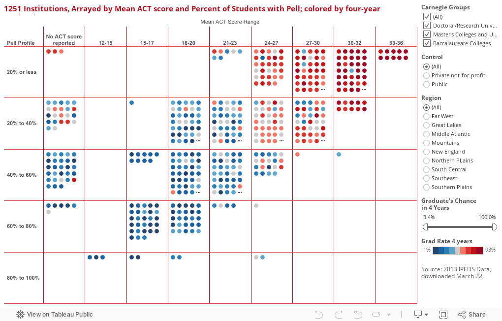
I've tried to demonstrate this in this visualization, and I like the simplicity here. Each dot is a college (hover over it for details). They're in boxes based on the average freshman ACT score across the top, and the percentage of students with Pell along the side. The dots are colored by four-year graduation rates, and you should see right away the pattern that emerges. Red dots (top right) tend to be selective colleges with fewer poor students.
But if you want to look at the chance a graduate will finish in four years, use the filter at the bottom right. Find a number you like, pull the left slider up to it, and see who remains. (Just a note: I'm a little suspicious of any number of 100% on this scale, which would mean absolutely no students who graduate take longer than four years to do so. It might be true, but it's hard to believe. But I'd set the right slider to 99% at the most.) Remember, there's a lot of bad IPEDS data out there, so don't place any bar bets on what you see here.
What do you see?
Judul : Another Way of Looking at Graduation Rates
link : Another Way of Looking at Graduation Rates
Another Way of Looking at Graduation Rates
Demikianlah Artikel Another Way of Looking at Graduation Rates
Sekianlah artikel Another Way of Looking at Graduation Rates kali ini, mudah-mudahan bisa memberi manfaat untuk anda semua. baiklah, sampai jumpa di postingan artikel lainnya.
Anda sekarang membaca artikel Another Way of Looking at Graduation Rates dengan alamat link https://zodiagzone.blogspot.com/2015/03/another-way-of-looking-at-graduation.html


0 komentar:
Posting Komentar